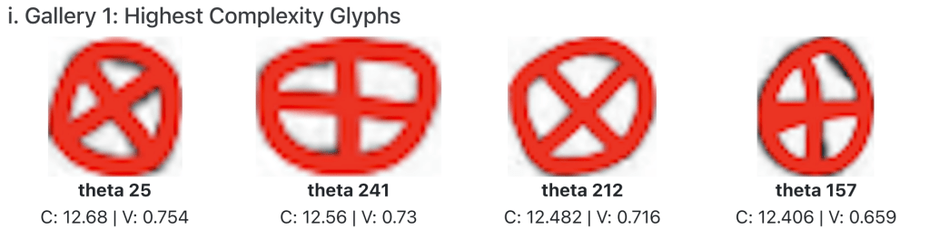
The twelve most complex glyphs in the Styra lead tablet dataset—all thetas. “C” denotes calculated complexity; “V” indicates vertical symmetry. For more context, see the abridged Styra dataset report.
If symmetry was the most natural place to begin—clean, measurable, culturally resonant—then complexity is where things get thornier. This post is about defining and quantifying visual complexity in early Greek letterforms, and why it matters for understanding both the mechanics and the aesthetics of the alphabet’s evolution.
Why Complexity?
Symmetry tells us how aligned a letterform is to itself. Complexity, by contrast, captures how much is going on—how many strokes, how much intersection, the degree of irregularity. Where symmetry can often be intuited at a glance, complexity resists easy perception—but it may prove just as revealing.
I’m interested in complexity as I suspect it plays a major role in the process of visual regularization. If the transmission of the Greek alphabet involved adaptation and simplification, as many have proposed, then more complex letterforms might point toward earlier or more conservative stages. In other cases, complexity might reflect local experimentation or ornamental flair. Either way, tracking it diachronically and geographically could tell us when and where scribes began to standardize—or drift.
How I’m Defining It (For Now)
Unlike symmetry, which can be modeled with relatively stable geometric principles, complexity requires interpretive decisions. For now, I’m treating it as a composite score, derived from features already being measured in APEX. My provisional formula looks like this:
+ (0.5)Stroke_Count + (0.5)Stroke_Intersections
– (0.2)Curvature – (0.2)Symmetry [composed of reflectional and rotational].
In short: more strokes and intersections add complexity, while curvature and symmetry reduce it. Each term is then normalized on a 0–1 scale.
I’m also considering adding a term for relative stroke length, to account for letters that are not just busy but expansive.
Likewise, I’m thinking about adding script direction: if boustrophedon or Schlangenschrift, that adds some complexity too; perhaps adding .5 for the former and 1 for the latter; however, this is an inscription-level feature rather than letter-level. Perhaps I have a separate complexity feature for the overall inscription, including things like average orientation, internal orientation consistency, and internal letter consistency.
Note: this is emphatically a first draft. The weights are intuitive rather than statistically derived, and the model doesn’t yet differentiate between necessary complexity (as in psi or early mu) and anomalous embellishment. Still, it gives me a way to compare letters on a rough scale—from clean and minimal to dense and ornate. I’m also fortunately free of having to account for degree of serif, as this emerges much later and so is outside of my scope (at least for now), and I get the sense a computer would struggle to measure that feature.
If you have any ideas or input please email me at tfavdw@nyu.edu! I’d love to hear from readers on this.
The Value of a Secondary Feature
Complexity is a secondary analysis within APEX. It draws on multiple primary measurements (stroke count, symmetry, curvature, etc.), and as such, it’s vulnerable to all the noise and ambiguity in those inputs. But it also offers a different kind of power: it’s a synthetic trait, one that may correlate with regional style, inscription context, material, date, or internal regularity.
Some questions I’m exploring through this lens:
- Do earlier inscriptions have higher average complexity?
- Are some regions more tolerant of complexity than others?
- Which places and periods hew more closely to Phoenician models? Similar complexity scores between Greek and Phoenician forms may offer a useful proxy for scribal conservatism.
- Does higher complexity correlate with less consistency within a single inscription?
- Are certain materials (pottery, stone, lead) more prone to complex forms?
Eventually, I’d like to correlate complexity with features like orientation consistency, inter-letter spacing, and standardization level—some of which are already outlined in the APEX coding manual.
The Bigger Picture
If symmetry is about balance, complexity is about density, constraint, and the friction between tradition and invention. My goal isn’t to reward simplicity or penalize elaboration—it’s to understand what these features meant, when they appeared, and how they were shaped by the scribes who carved them.

Leave a comment